12 / 11 / 2025
Low Tech, High Life: How Our Partner Loonatiks Built the TY-CO Identity
The brand book, festival identity and website designed by Loonatiks Design Crew, our TY-CO partner in Athens
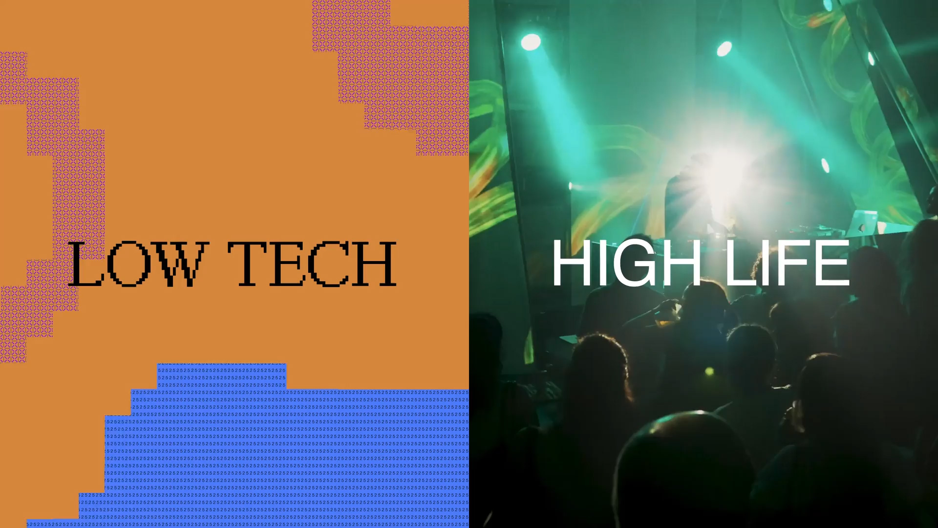
Every TY-CO activity, from a roundtable in Porto to a mural walk in Nicosia, needed to look like it belonged to the same family. Our partner Loonatiks Design Crew, a typography-led design studio founded in Athens in 2017, built that family: the TY-CO brand book, the visual identity for ABR Festival 2025, and the project website.
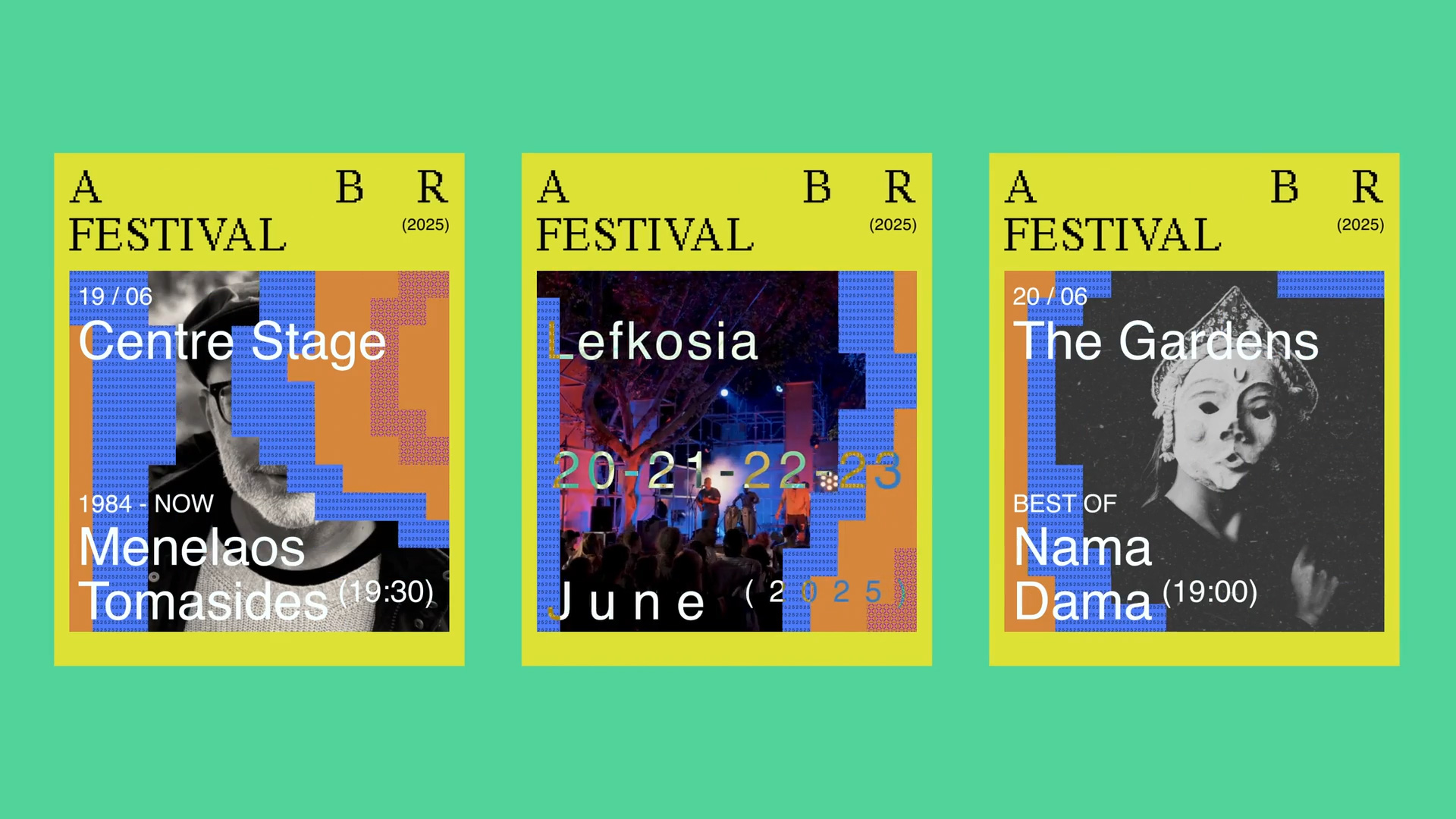
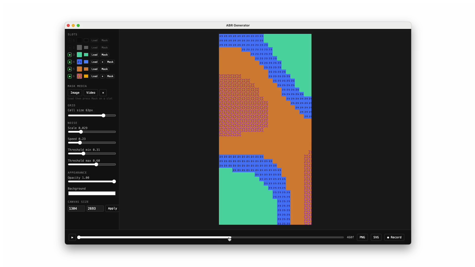
Their starting point was a contrast: Low Tech and High Life. A custom pixel typeface sits next to Helvetica, and a pattern generated in code moves across posters, screens, merch and stages, so that every printed piece is a frozen moment of an identity that never stands still.
TY-CO
A logo built to host others
The brand book, created as part of TY-CO, sets out a modular logo built on Helvetica. It has two parts: Alternative Brains Rule Festival, the parent brand, which stays fixed, and (TY-CO), a flexible space that can host different events, collaborations and initiatives.
That way the system can take on new sub-brands, themes and event names without losing its shape. Helvetica keeps it clear, neutral and legible in print and on screen, with no decoration getting in the way of the content.
Rhythm in the letters
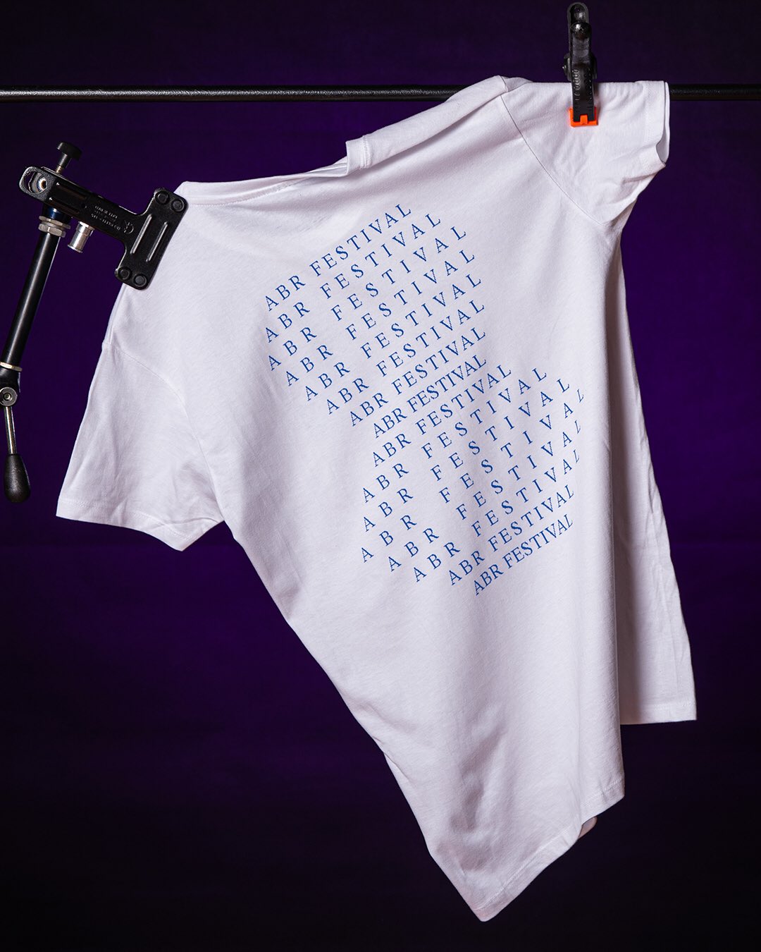
A secondary logotype pulls the initials apart while keeping their original positions: A B R. The empty space between the letters works like a beat, a playful nod to sound, improvisation and the festival's experimental side.
The acronym A.B.R. Festival (TY-CO) does the opposite: compact, punctuated and easy to recognise at small sizes. One version deconstructs, the other is clean and efficient, and both come from the same modular system.
Low Tech, High Life
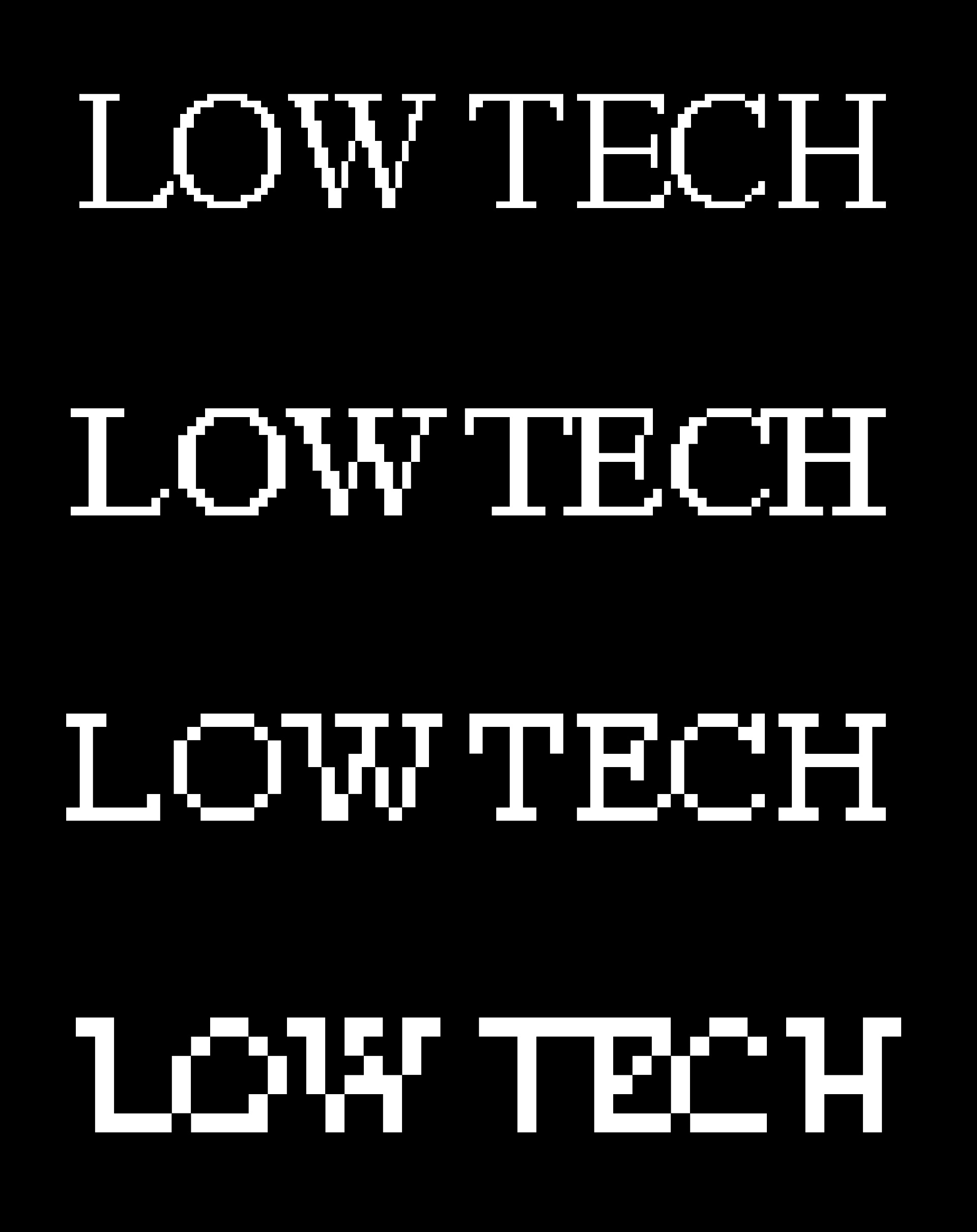
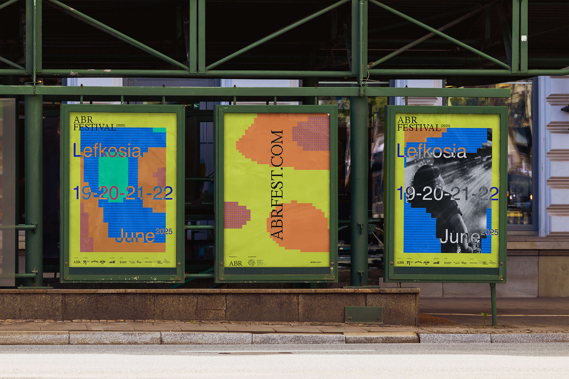
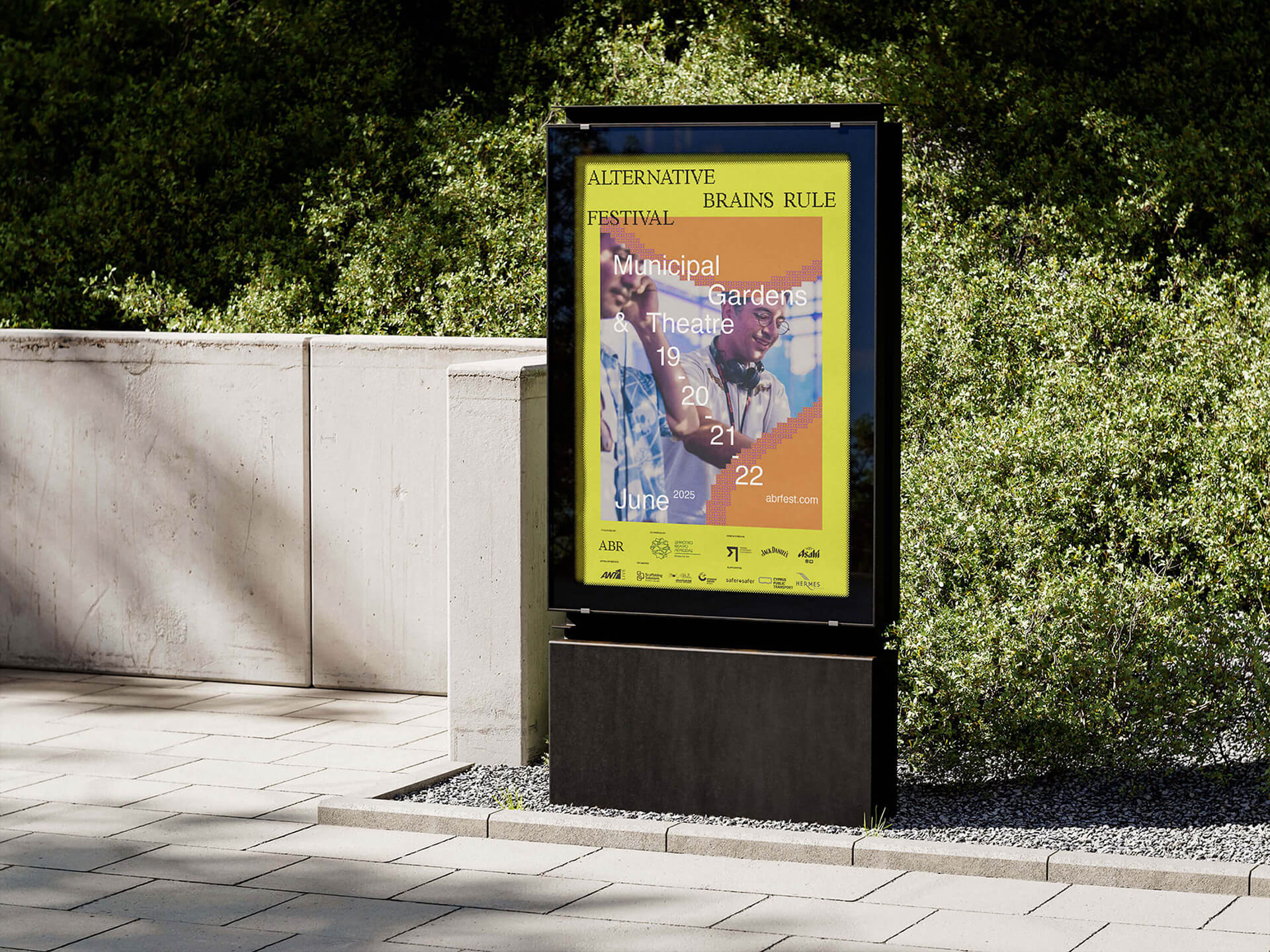
For ABR Festival 2025, Loonatiks added an expressive layer. Their custom pixel typeface, which takes letterforms apart and rebuilds them, stands for Low Tech: a step back from the speed of modern life. Helvetica stands for High Life: the clarity and precision of Swiss design.
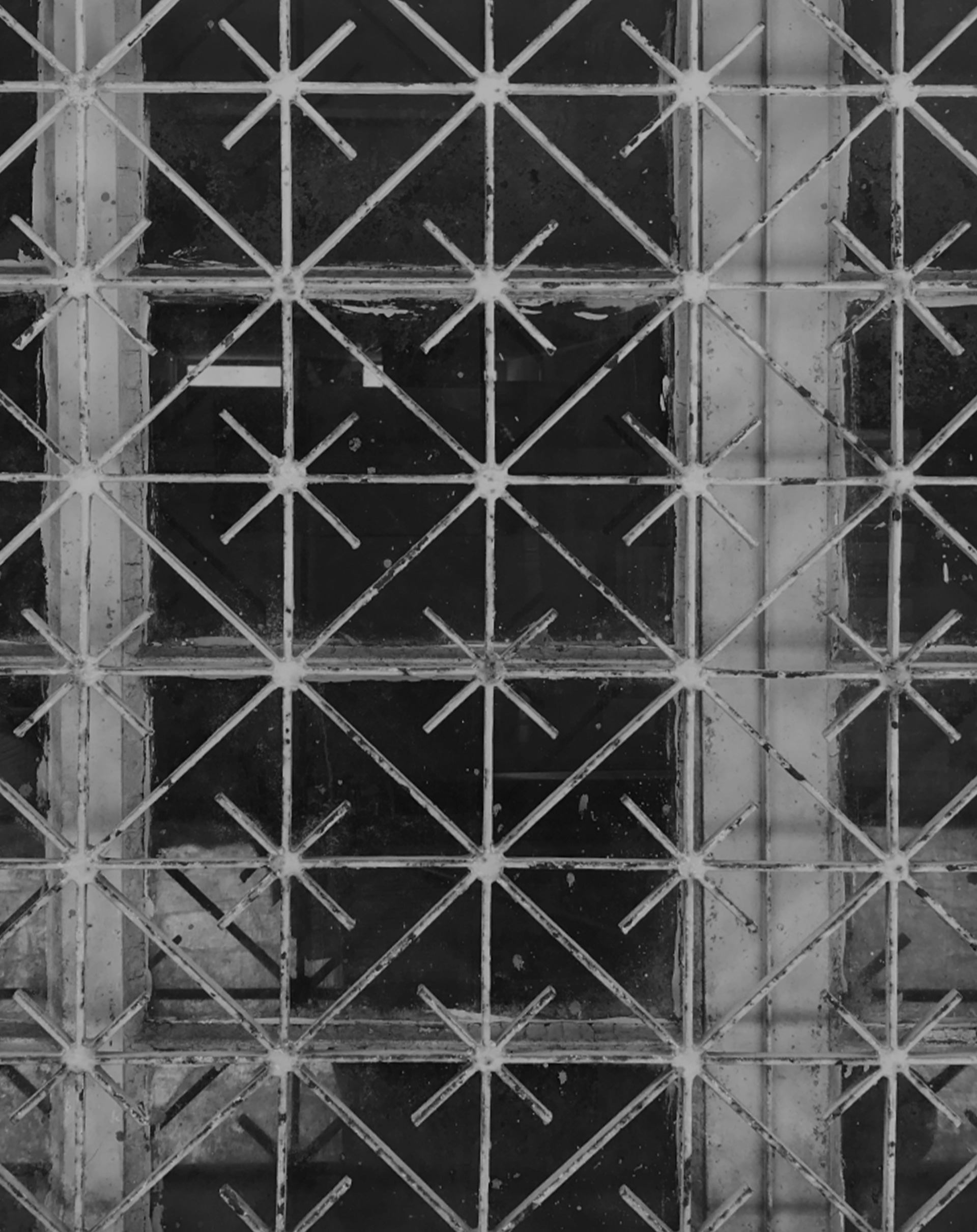
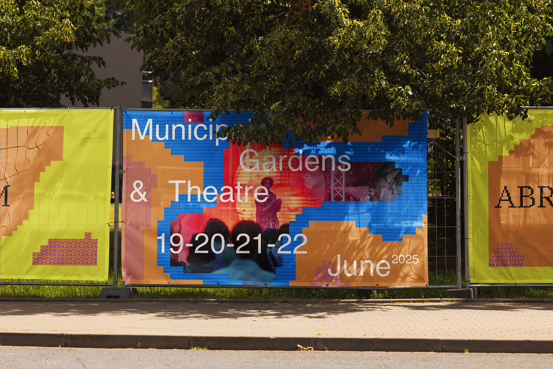
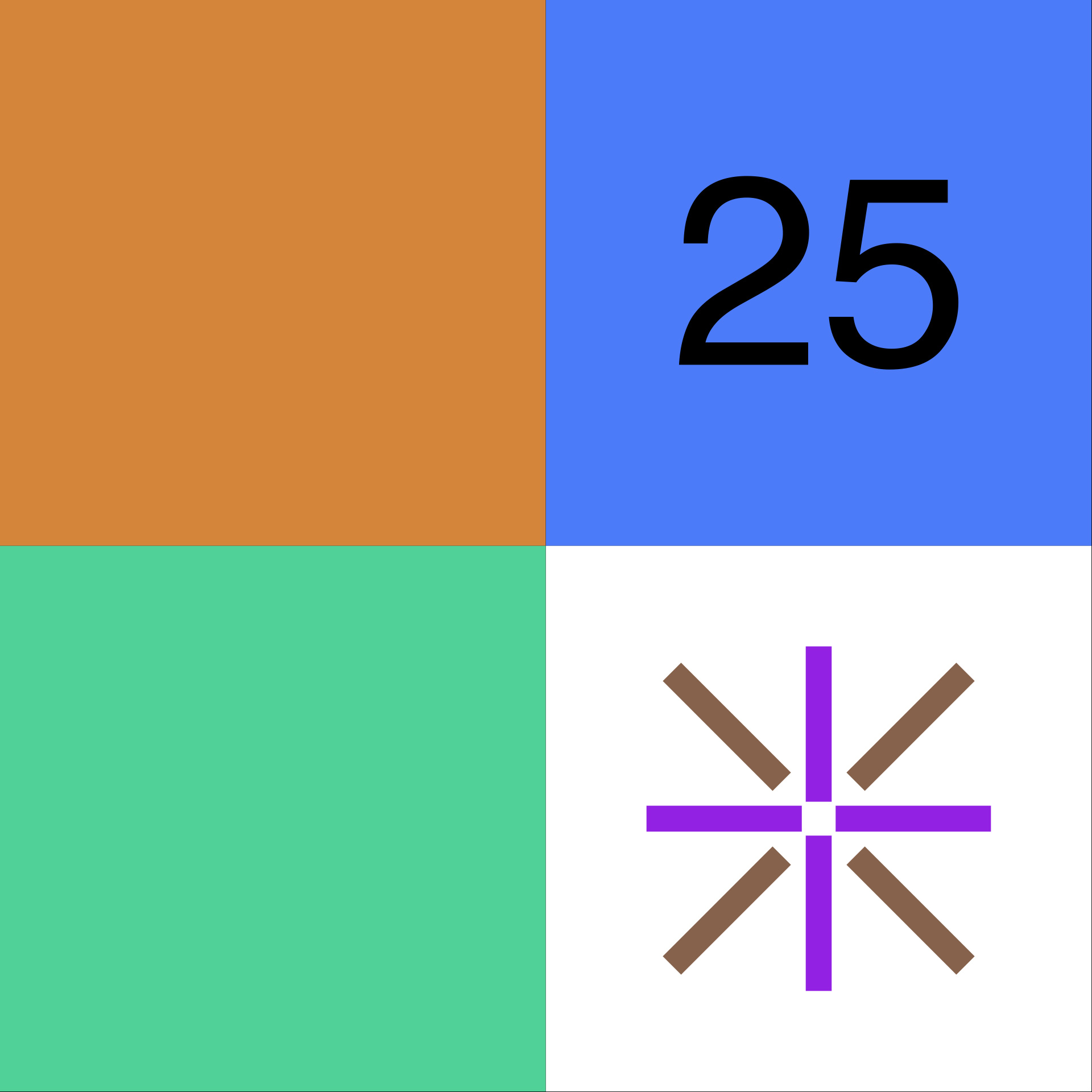
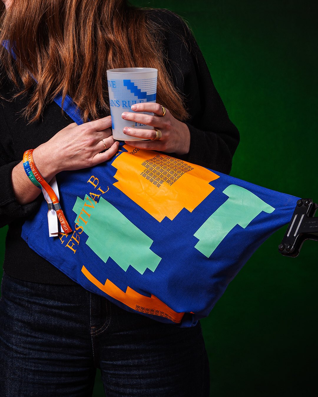
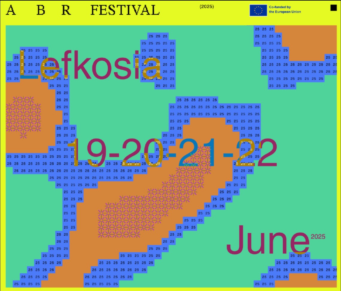
The tension between the two mirrors the festival itself, where different genres, cultures and people share the same space. Four tiles make up the mosaic: mint green, warm orange, a black "25" on blue, and an asteroid-like shape taken from the metal window grilles of Nicosia.
A VISUAL SYSTEM BUILT ON CONTRAST, SHAPED BY CULTURE, AND DESIGNED TO MOVE
Generated in code
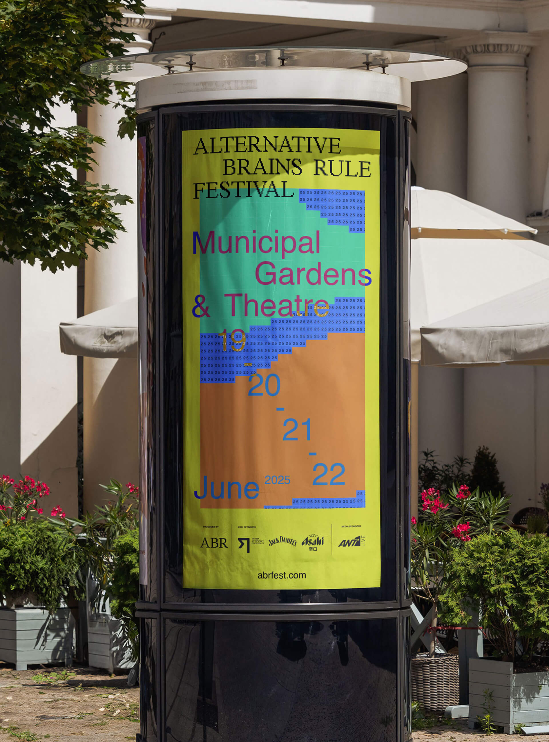
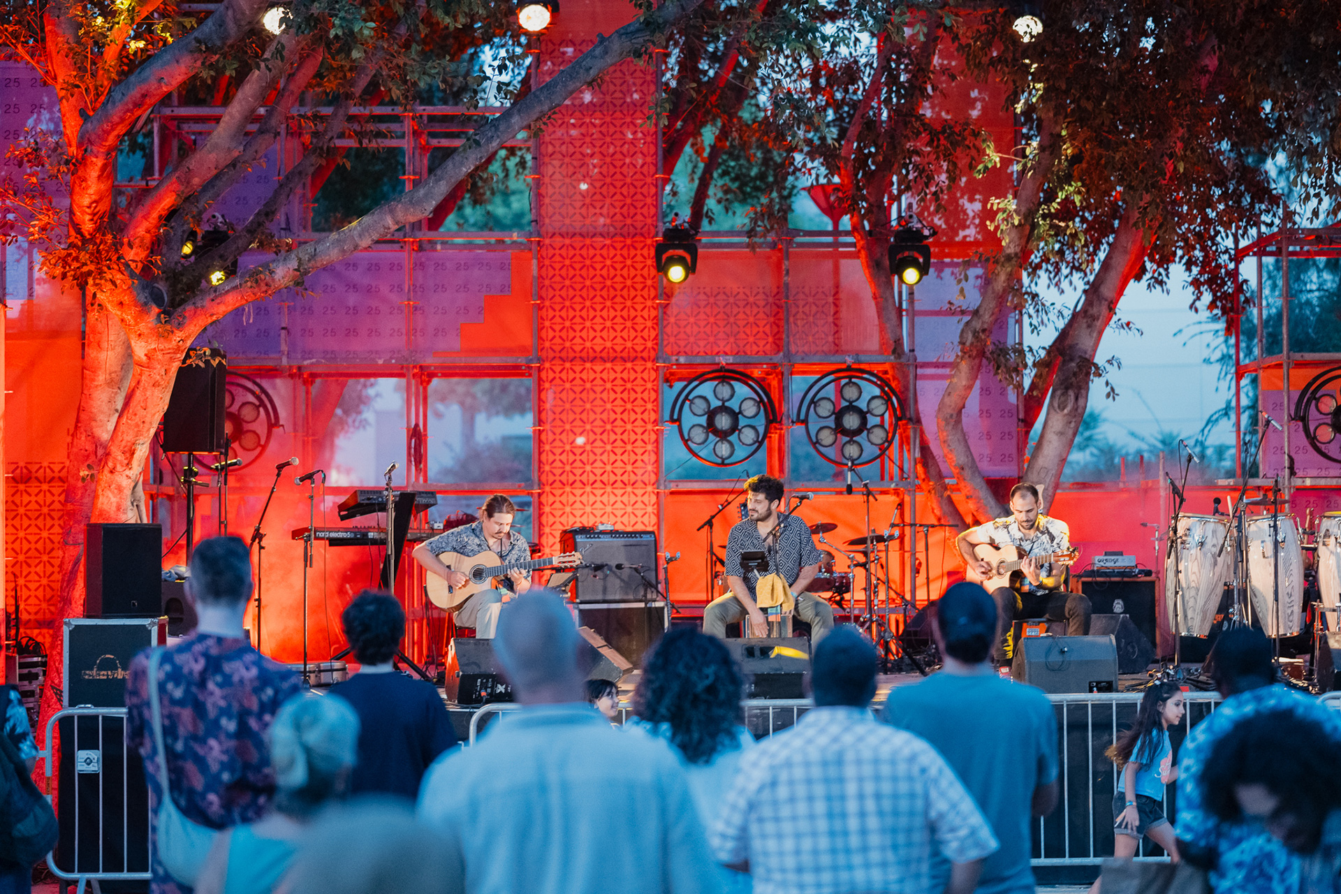
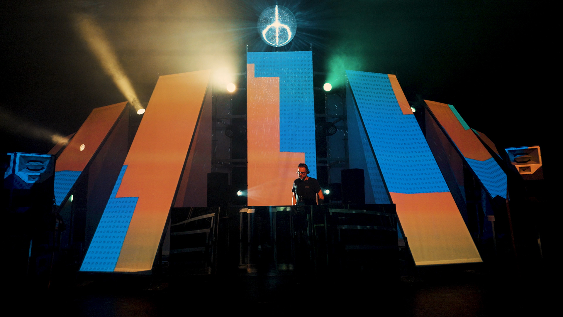
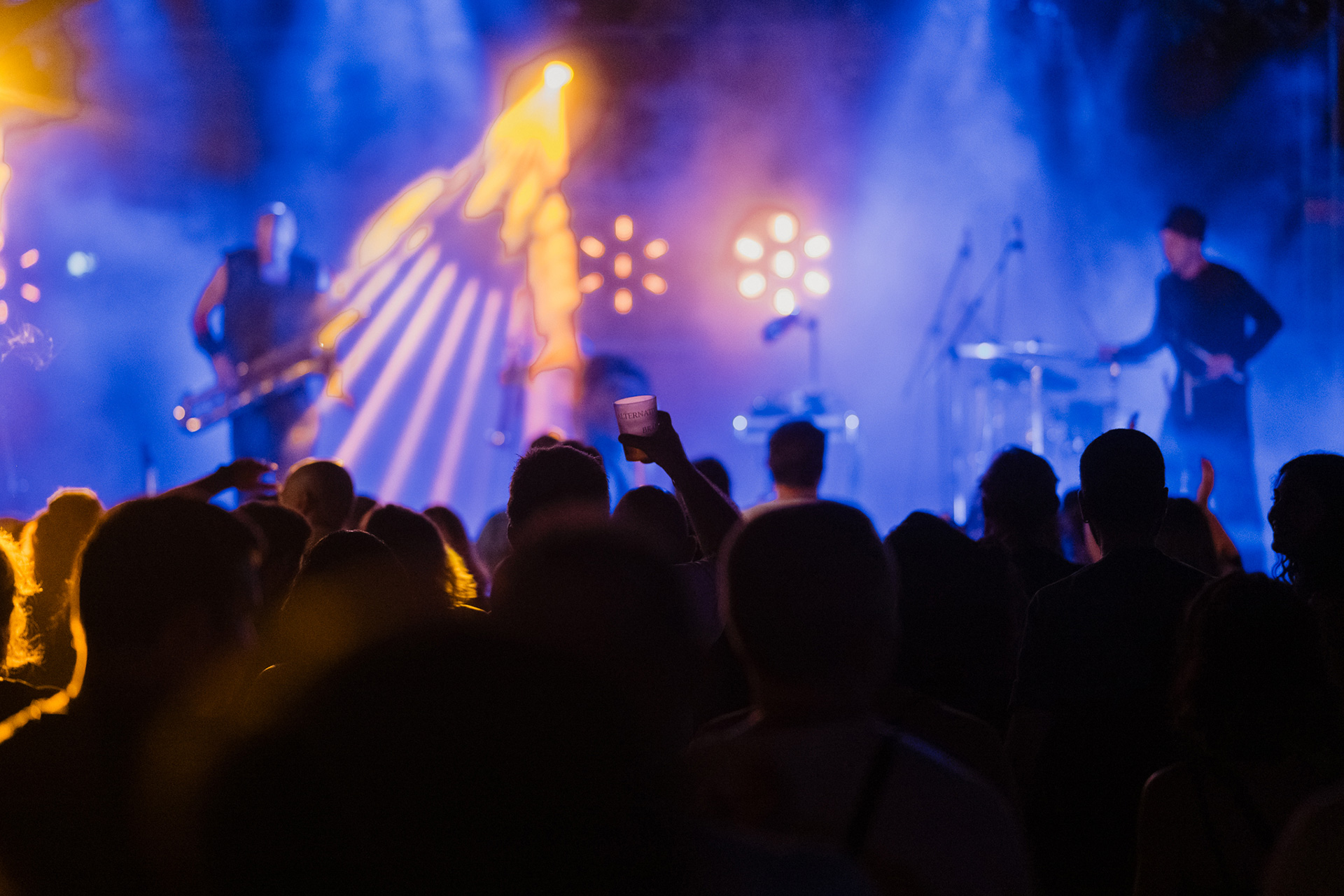
The festival posters were made in Processing: each background is a unique snapshot of the animated pattern, with Helvetica for the information and the pixel typeface for the logo.
From there the pattern ran across social media, motion graphics, street banners, merch, the stage and projection mapping.
A home online
Loonatiks also designed the TY-CO website, developed with Yannick Gregoire and live since 13 April 2025. It brings together the project background, partners, events, articles, podcasts and media, with accessibility and a low digital footprint built in.
It is updated with material from all partners, and will stay online after the project ends, as a record of TY-CO and what comes next.
See the full ABR Festival 2025 project on the Loonatiks website →
See the project on Instagram
Credits
Identity, brand book and website design: Loonatiks Design Crew
Brand strategy: Olympia Aivazi
Assistant graphic design: @adonispdesign
Website development: Yannick Gregoire
Exterior photography: Michalis Demetriades
Studio photography: Konstantinos Gikas
Images: Loonatiks Design Crew and ABR Festival
TY-CO (communities in conversation) · ABR – Alternative Brains Rule · Co-funded by the European Union
Funded by the European Union. Views and opinions expressed are however, those of the author(s) only and do not necessarily reflect those of the European Union or the European Education and Culture Executive Agency (EACEA). Neither the European Union nor EACEA can be held responsible for them.